Ever notice how boring most cars are colored? Look out on the roads and notice 99% of cars fall into one of these categories:
- White
- Black
- Gray/Silver (just some shade between white and black)
- Dark Blue
- Dark Red (the closest we get to a vibrant color)
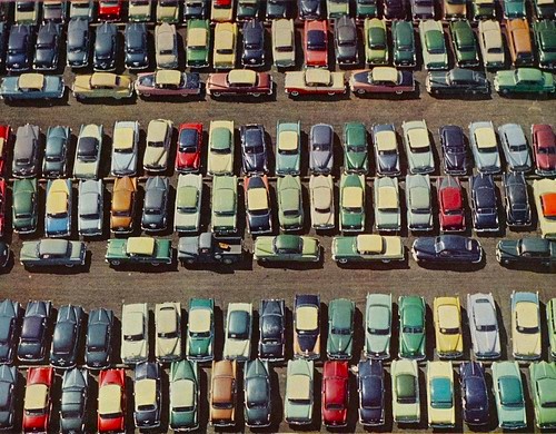
Check out movies, TV shows, photos, and more from the 1950s to 1980s, and you’ll notice all the wonderful variety of car colors there was. Just take a look at all these unique cars:

Something started to change in the 1990s. Perhaps the culture was to choose safer colors? Maybe people became more obsessed with resale value? I’ve been told it’s easier to resell a car in a dull color.
This came to mind while I was narrowing my emails to 42 characters. While pasting some email text it showed up as Times New Roman font instead of the usual Arial font. My blog uses Segoe UI font, which is similar to Arial.
I wondered, “Maybe there’s a better font to use than the usual Arial font for marketing emails?”
I started researching changing to another font. After weighing the pros and cons, I settled on Georgia font! It’s still a very readable font, but it stands out from the usual, boring fonts like Arial I usually see in emails.
But it can never hurt to experiment with changing different aspects of your marketing and testing them against past results.
What font do you use? What have you tried in the past?
What are the current default fonts for the major email programs?
- Gmail uses Arial.
- Yahoo Mail uses Modern, which is virtually the same as Arial.
- Microsoft Outlook uses Aptos. (They recently changed from Calibri. I don’t have access to these in Google Docs).
Go out there and be different and get a colorful car (mine is “Blaze Yellow”) and try out a new email font!